Stripe Analytics Dashboard: Track MRR, Churn & LTV Without Baremetrics
August 19, 2026
·
Tim Liu

It’s Sunday night and you’re staring at your Stripe dashboard trying to figure out if you actually grew this month, or if you’re fooling yourself.
A few customers churned, someone downgraded, and you’re not sure the new signups covered the loss. So you open a spreadsheet and start pulling numbers by hand, an hour later, you still don’t trust what you’re looking at.
A stripe analytics dashboard fixes this by turning raw Stripe data into the numbers that actually answer that question. The MRR, churn, and lifetime value is calculated consistently with no spreadsheet required.
Why Stripe’s Built-In Numbers Don’t Tell the Full Story
Open your Stripe dashboard and you’ll see an MRR figure right at the top. It looks authoritative. The problem is how it’s calculated.
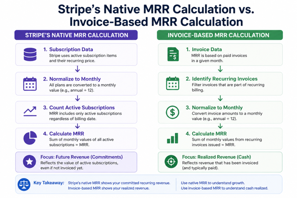
Stripe’s native MRR is based on your subscription objects, what customers are scheduled to pay based on their plan. That’s a reasonable starting point, but it misses a few things:
- Timing. Stripe’s MRR reflects the billing cycle, not necessarily when an invoice was actually paid.
- Discounts and proration. Coupons, mid-cycle plan changes, and prorated upgrades don’t always show up cleanly in the headline number without checking the underlying invoice line items.
- Trials and cancellations. A trialing customer, or one who canceled but is still inside a paid period, can inflate or understate what you’d call “recurring revenue right now.”
None of this means Stripe’s numbers are wrong, they’re accurate for what they measure: subscription state.
But “subscription state” and “revenue actually collected” are two different things, and mixing them up is how founders get surprised at fundraising time.
A stripe revenue dashboard built on invoice-level data, what was actually charged and paid, not just what’s scheduled, closes that gap.
The Core Metrics a Stripe Analytics Dashboard Should Track
You don’t need dozens of charts. You need a handful of numbers, tracked consistently, that tell you the same story every time you look.
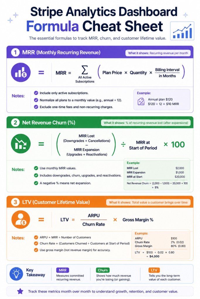
MRR (Monthly Recurring Revenue)
A predictable revenue you can count on next month. Calculated from active, paying subscriptions, ideally based on actual invoice payments rather than scheduled billing.
Churn
There are two types: Logo churn counts customers lost. Revenue churn (or MRR churn) counts dollars lost. You can lose ten small customers and gain two large ones, logo churn looks bad, revenue churn looks great. Track both, but weight revenue churn more heavily for financial decisions.
Revenue Churn = (Lost MRR + Downgrade MRR) ÷ Starting MRR
LTV (Lifetime Value)
The total revenue you expect from a customer before they churn. A simple version: average revenue per account divided by monthly churn rate. It’s a rough estimate, but useful for judging whether acquisition costs make sense.
NRR (Net Revenue Retention)
It shows how your existing customers grow or shrink on their own, from upgrades and downgrades, excluding new sales. Above 100% means existing customers are expanding faster than they’re leaving.
A good stripe subscription analytics setup surfaces all four of these on one screen, updated automatically, without you exporting a CSV every Monday morning.
What to Look For in a Stripe Analytics Tool
Not every stripe reporting tool is built the same way. A few things worth checking first:
- Real-time sync: continuous updates, or a once-a-day batch?
- Segmentation: can you break MRR or churn down by plan, billing frequency, or cohort or is it one fixed chart?
- Flexibility: most tools give you a preset list of metrics and stop there. If your question isn’t on the list, you’re back to exporting data.
- Sharing: a live link for a co-founder or investor, or does everyone need their own seat?
Flexibility is usually where founders hit a wall. A fixed dashboard answers the standard questions well, but the moment you need something specific, like churn for customers on the annual plan over the last two quarters, a preset tool can’t follow you there.
Building a Stripe Analytics Dashboard with Papercrane
Papercrane takes a different approach than a fixed-metrics dashboard. Instead of picking from a list of preset charts, you connect Stripe and ask for what you want to see in plain language.
The setup itself is simple:
- Connect Stripe. Link your account once through Papercrane’s Stripe integration, no credentials to keep re-entering.
- Ask for your dashboard. Type what you want to track like “MRR by plan, monthly vs. annual” or “churn rate for customers acquired in Q1”, and the dashboard builds itself, pulling from your actual Stripe data.
- Share it. Get a live link. Send it to your team, embed it in an internal tool, or put it in front of an investor, no extra logins required on their end.
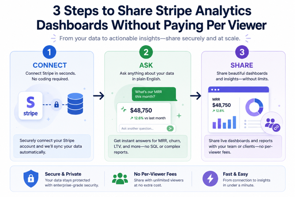
Because it’s AI-native rather than template-based, you’re not limited to a fixed metric list. If your first dashboard doesn’t answer the question you actually had, you ask again and it adjusts, instead of exporting to a spreadsheet to finish the job manually.
Stripe Analytics Dashboard vs. Baremetrics: Quick Comparison
If you’re deciding between Papercrane and Baremetrics for Stripe analytics, the differences come down to setup, metric flexibility, segmentation, sharing, and data sources.
| Criteria | Papercrane | Baremetrics |
|---|---|---|
| Setup | Connect Stripe, ask in plain language | Connect Stripe, preset dashboard loads |
| Metrics | Custom, ask for any cut of your data | Fixed set of 26 preset SaaS metrics |
| Segmentation | Flexible, on request | Limited to built-in filters |
| Sharing | Public link, no viewer account needed | Seat-based access for teammates |
| Data sources | Stripe plus 50+ other sources (BigQuery, HubSpot, GA4, and more) | Primarily Stripe and a handful of billing platforms |
If you only ever need the standard SaaS metrics and nothing else, a preset tool like Baremetrics does the job well. If your questions change month to month, a flexible, ask-anything dashboard keeps up without a new export every time.
FAQ
Is Stripe’s built-in MRR number accurate?
It’s accurate for what it measures, scheduled subscription revenue but it doesn’t always match actual invoice-based revenue once you factor in proration, discounts, and trial periods.
Do I need to know SQL to build a Stripe dashboard?
No. Stripe’s own advanced reporting tool (Sigma) does require SQL, which is exactly why most SaaS teams use a separate stripe analytics dashboard tool instead. You ask for what you need in plain language and the tool handles the query.
Can I track churn by plan without writing custom queries?
Yes, with the right tool. A flexible, AI-native dashboard lets you ask for a specific segment like churn by plan or by signup cohort, without needing an analyst to write it for you each time.
What’s the difference between logo churn and revenue churn?
Logo churn counts the number of customers you lost. Revenue churn counts the dollars lost. They can move in opposite directions, so it’s worth tracking both rather than relying on just one.
Bringing It Together
A stripe analytics dashboard shouldn’t require a data team, a SQL course, or a rigid list of preset charts to be useful.
Connect your Stripe account, ask for the specific numbers your business actually needs MRR, churn, LTV, and beyond. Get a live dashboard you can share with anyone, no Baremetrics subscription required.
Ready to see your own numbers? Check Papercrane’s pricing and connect your Stripe account in a few minutes.
Related reading: Building a SaaS Dashboard That Actually Gets Used