SaaS Dashboard: Track MRR, Churn and Cohorts Without an Analyst
August 7, 2026
·
Tim Liu

A SaaS metrics dashboard is a single view of your most important numbers, MRR, churn, retention, and cohorts.
It replaces spreadsheets, CSV exports, and one-off reports. Most founders don’t have one. They have pieces of one, scattered across different tools.
Where Your Numbers Actually Live Right Now
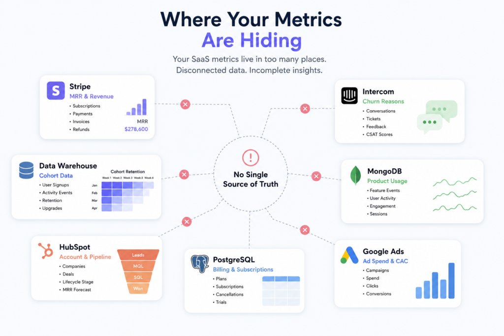
Your revenue data sits in Stripe. Your churn reasons live in a support tool, or in nobody’s memory at all. Your cohort data is buried in a database only your engineer can query.
Every Monday, someone stitches these together by hand. Usually it’s the founder. Sometimes it’s whoever’s turn it is to build the investor update.
This isn’t a tooling problem. It’s a visibility problem. Your metrics exist. They’re just not talking to each other.
Common places metrics get stuck:
- MRR and revenue data in Stripe or your billing system
- Churn reasons in support tickets or exit surveys
- Cohort and signup data in your product database
- Everything else in a spreadsheet someone updates by hand
What It Actually Costs You
When your metrics live in five places, you don’t see problems until they’re big. A churn spike shows up a month late, after it’s already hurt revenue.
Board updates take a full day to prepare instead of five minutes. Retention issues look like random noise instead of a clear pattern, because nobody has time to break them down by cohort.
None of this is a data problem. It’s a dashboard problem. Once your numbers are in one place, the pattern is usually obvious.
What a Real SaaS Metrics Dashboard Should Show
A dashboard isn’t useful just because it has charts. It’s useful because it answers real questions fast. Here’s what actually belongs on one.
MRR: The Number Everything Else Builds On
Monthly recurring revenue is your baseline. But the total number alone hides what’s happening underneath it.
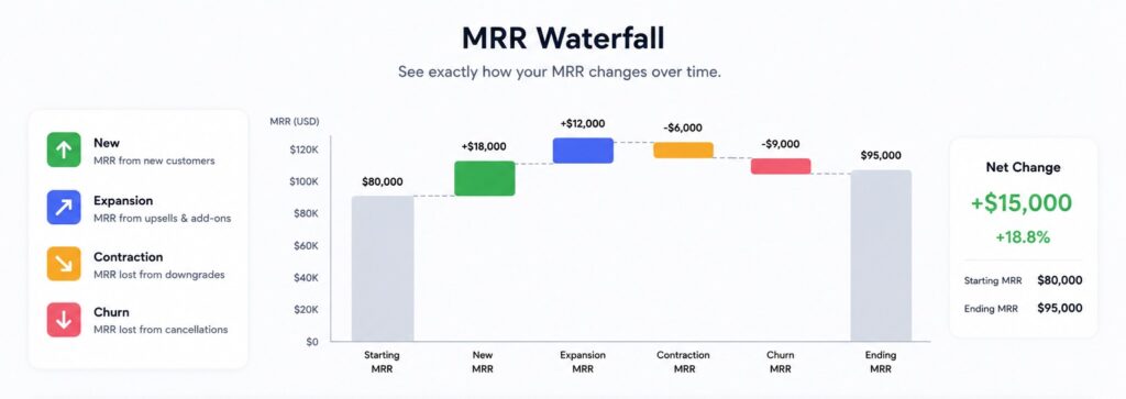
A good MRR dashboard breaks revenue into four parts:
- New MRR from new customers
- Expansion MRR from upgrades
- Contraction MRR from downgrades
- Churned MRR from cancellations
This is often shown as a waterfall chart. It shows exactly why MRR moved, not just that it moved.
Churn: Gross vs. Net
A churn dashboard should never show one churn number. It should show two.
Gross churn is revenue lost from cancellations and downgrades. Net churn subtracts any expansion revenue from that loss. You can have high gross churn and still grow, if expansion is strong enough to cover it.
Investors read net churn first. It tells them whether your existing customers are funding your growth or draining it.
A customer retention dashboard tracks this over time, not just as a single monthly snapshot. Trends matter more than any one number.
Cohort Analysis: Where the Real Story Hides
Blended churn hides problems. A cohort analysis dashboard doesn’t.
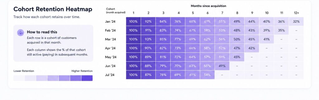
It groups customers by the month they signed up, then tracks how many are still active each month after. This shows whether retention is improving or getting worse for newer customers, even if your overall churn number looks stable.
If cohort three months ago retains worse than cohort six months ago, something changed. A blended number would never show you that.
How Papercrane Solves This
Papercrane is an AI dashboard builder that connects your data and builds this dashboard for you. No SQL, no analyst, no spreadsheet stitched together by hand.
You connect Stripe, your CRM, or your product database. You describe what you want in plain English: “show me MRR by component” or “show me cohort retention for the last six months.” Papercrane builds the chart.
This works the same way our team built an AI dashboard builder without SQL for broader business reporting. The same approach applies directly to SaaS metrics, just with MRR, churn, and cohorts as the focus instead of general analytics.
What the Process Actually Looks Like
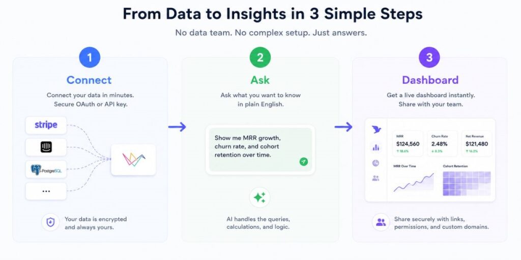
Getting your dashboard live takes three steps.
- Connect your data. Link Stripe, your CRM, or your database in a few clicks.
- Ask for what you want. Type a plain-English request instead of writing a query.
- Get your dashboard. MRR, churn, and cohort views populate automatically.
No engineer required. No waiting on an analyst’s queue. Most teams have a working dashboard within minutes of connecting their data.
See Your Metrics in One Place
Stop rebuilding the same report every month. Connect your data, ask Papercrane what you want to see, and get live MRR, churn, and cohort SaaS dashboards in minutes.
Try Papercrane free and see your first dashboard populate today.
Frequently Asked Questions
What metrics should a SaaS dashboard track?
At minimum: MRR and its components, gross and net churn, retention rate, and cohort analysis. These four give you a full picture of revenue health.
How is this different from a churn dashboard alone?
A churn dashboard shows one piece of the story. A full SaaS metrics dashboard connects churn to revenue and cohorts, so you can see why churn is happening, not just that it is.
Do I need an analyst to set this up?
No. Tools like Papercrane connect directly to your data sources and build the dashboard from a plain-English request. No SQL or technical setup required.